CHRISTINA MENDOZA
UX Research for Inventory Operations &
Vendor Efficiency-Enterprise B2B Tools
By Christina Mendoza
Part 1: Scaling Product Operations
Overview
As the sole Product Operations Manager at Dollar General, I led the UX research and operational strategy behind a new Inventory Control Tower—an enterprise tool for internal teams and vendor partners. While my remit spanned operations across 45+ teams, I was embedded in the research and implementation of this platform, which aimed to improve supply chain visibility, vendor alignment, and decision-making.
To drive this initiative, I conducted extensive user research, synthesized pain points across stakeholder groups, and translated findings into wireframes, service blueprints, and high-fidelity prototypes. My work introduced structured planning and cross-functional clarity across UX, product, and engineering—laying the foundation for a scalable, insight-driven approach to enterprise tool development.
Product Operations Leadership Highlights
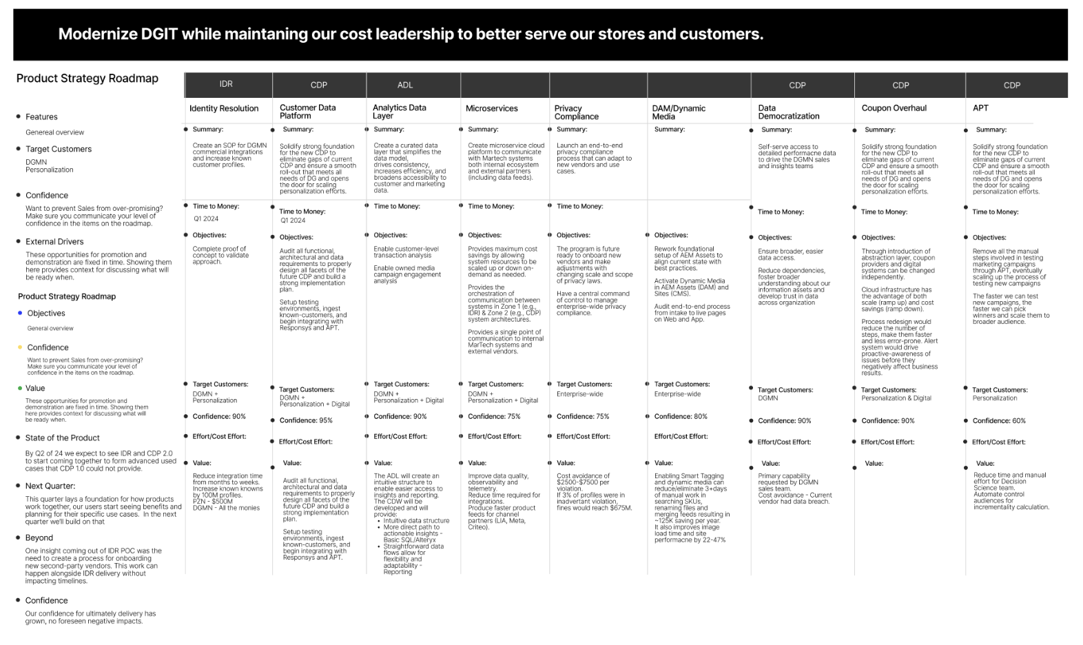
Roadmap Framework – Created a unified roadmap format to replace team-specific versions, enabling clearer cross-team alignment and executive visibility into product planning.
Discovery Workshops – Led structured goal-setting and prioritization sessions to help product teams articulate business value and strategic impact.
UXOps Toolkit – Built shared documentation systems in Notion and Confluence to track research insights, decision logs, and cross-functional dependencies.
Alignment Rituals – Introduced lightweight async reviews, UX playbacks, and feedback loops to reduce meeting time and increase operational clarity.
Strategic Dashboards – Designed and launched a Product Ops Team Dashboard for real-time feature tracking, and an Executive Strategy Dashboard to surface high-level metrics on product performance, financials, and strategic goals.
Roadmap Framework Snapshot
A roadmap format used to unify quarterly planning across 10+ teams.
Product Ops Team Strategy and Executive Strategy Dashboard
Empowering product teams with detailed insights and metrics for informed decision-making and efficient feature development tracking and providing executives a concise, high-level overview of product performance, financial health, and strategic alignment for informed organizational decision-making.
Impact Highlights
Established a unified, reusable roadmap structure adopted across 10+ product teams, driving consistency and strategic visibility.
Coached dozens of product managers through discovery frameworks and helped articulate business value more effectively in planning and stakeholder conversations.
Increased UX visibility in prioritization processes, integrating research milestones and design considerations into roadmap planning.
Developed a Product Ops Team Strategy dashboard to empower product teams with real-time insights and feature tracking.
Designed an Executive Strategy Dashboard providing leadership with high-level metrics on product performance, financial alignment, and strategic objectives.
Operational frameworks and toolkits were adopted across multiple verticals, reinforcing a culture of scalable, discovery-led product management.
Part 2: UX Case Study - Inventory Control Tower
Overview
Midway through my tenure, I was brought in to lead discovery for a high-priority initiative: the Inventory Control Tower (ICT), a centralized platform to reduce stockouts, overstocks, and fragmented workflows. I was brought in to lead the discovery phase, align stakeholders, and ensure the right problems were being solved.
UX Research & Facilitation Highlights
Discovery Workshops - Facilitated cross-functional sessions using card sorting and OST to surface key inventory challenges.
Stakeholder Alignment - Acted as the connective thread between product, engineering, and business to clarify goals and priorities.
Execution Support - Helped translate research insights into actionable features and early prototypes.
Discovery Workshop Snapshots
A look at the collaborative sessions where stakeholders sorted cards, mapped tasks, and surfaced shared inventory challenges.
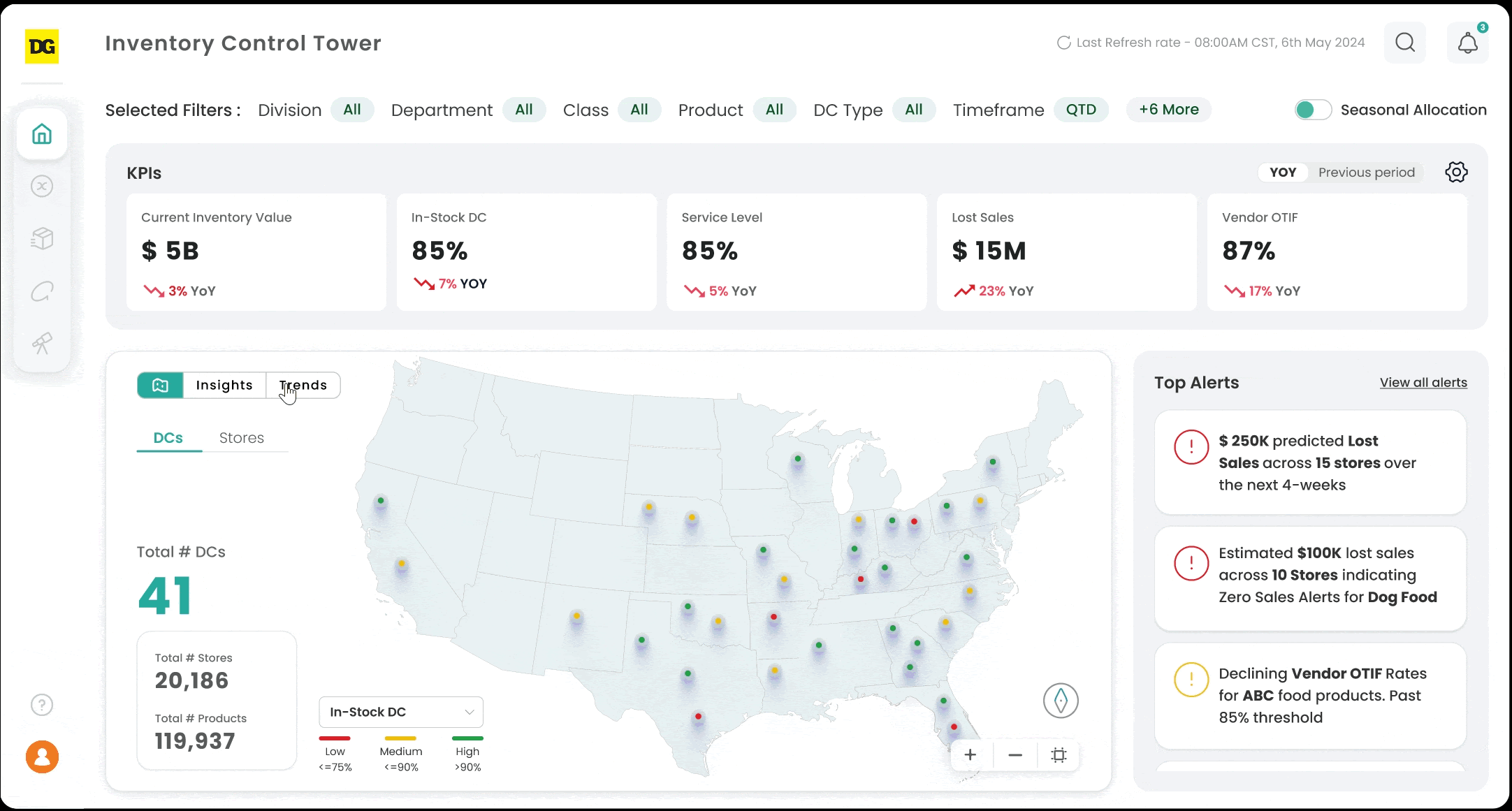
Prototype & UI Demo
A short demo of the high-fidelity prototype used for usability testing, including the dashboard interface and issue escalation flows. (Designed on Figma)
Impact
Enabled real-time visibility into critical inventory issues
Helped reduce fragmented issue tracking and duplicated workflows
Strengthened alignment between planning, allocation, and supply chain teams
Contributed foundational research that shaped the MVP
Reflection
This project reaffirmed the value of research-led design and cross-functional facilitation, especially in complex enterprise settings where shared clarity can be the difference between success and stagnation.


From IBM Design Thinking to Real-World Impact:
Rethinking McDonald’s Mobile Pickup
By Christina Mendoza
Applying the Enterprise Design Loop to improve real systems—and imagine better ones.
Overview
As a participant in the IBM Accelerate Program (Design Track), I was selected to join an immersive, apprenticeship-style learning experience focused on enterprise UX research, prototyping, and product thinking. During the program, I worked closely with IBM mentors to apply the Enterprise Design Thinking Loop—Observe, Reflect, Make—while contributing to research-based artifacts for enterprise product teams.
After the program, I challenged myself to take what I learned and apply it independently, start to finish. The result is a self-initiated case study: a conceptual redesign of the McDonald’s mobile pickup experience, applying IBM’s process to a real-world friction point. While speculative, this project demonstrates my ability to take an idea, structure it using proven frameworks, and push it toward execution—just as I would on a real team.
What I Did
Framed the Problem – Identified a high-friction moment in everyday life: mobile order pickup at drive-thrus, where technology often gives way to confusion and inefficiency.
Applied a UX Process – Used the IBM Enterprise Design Loop to guide my approach from empathy to ideation, prototyping, and feedback.
Prototyped a Solution – Designed a new flow featuring QR code pickup integration, reducing the need for verbal confirmation and speeding up service.
Prepared for Testing & Handoff – Created a proposal-ready package that could be pitched to stakeholders, complete with design rationale and suggested research methods.
CASE STUDY: RETHINKING MCDONALD’S MOBILE PICKUP
Mobile ordering is fast and easy—until you reach the pickup window. Customers are often asked to repeat their order number, confirm their name, or explain they ordered via mobile—all of which slows down service and frustrates both users and staff.
My concept: a QR code flow integrated into the McDonald’s app, allowing customers to scan their order at the window. This would link the digital order with physical pickup, reduce verbal communication, and increase clarity for all parties.
How I Applied IBM’s Design Thinking Loop
Observe- I framed the research: What questions would I ask customers? How do employees currently retrieve mobile orders? Where does miscommunication happen?
Reflect- I mapped a hypothetical journey, spotlighting gaps in the current handoff between the app and the window experience. Common themes: confusion, repetition, and human error.
Make- I sketched wireframes for a redesigned flow with a dynamic QR code. I built a clickable prototype to show how this could feel in context and imagined possible key success metrics and testing methods for launch-readiness.
Concept Artifacts
📌 User Journey Map
A walkthrough of the current mobile order experience, from in-app checkout to drive-thru pickup, highlighting where confusion, repetition, and delays typically occur. This journey map would illustrate the service gap between digital confirmation and physical fulfillment, with callouts for moments of breakdown.
📱 Wireframes & Prototype Flow
A redesigned mobile journey showing how a scannable QR code could function as the new “confirmation page” within the app. This section would depict:
• The user’s flow from finalizing an order to receiving their unique QR code
• The moment the QR is presented at the drive-thru window scanner
• The system response for the employee: a simplified interface queuing scanned mobile orders in order of arrival
• Reduced verbal interaction—just a visual cue and a “Next window, please.” or “You’re all set—pull forward for pickup!”
This is also a fun opportunity to play with brand tone and enhance the QR code interaction moment. Include a McDonald’s logo or branded visual in the center of the QR code. Many major brands (like Starbucks, Spotify, or even PayPal) do this to create more branded, recognizable QR experiences.
💬 Employee Screen Message
For the employee interface, a message could say:
• “Mobile Order Scanned”
• “[Customer Name] – Mobile Pickup Confirmed”
• “New QR Order → #245”
• “Next: Greet and Send to Pickup”
These sketches would be annotated to show how the QR reduces error, speeds identification, and creates a clear visual handoff between user and staff.
Proposal Plan
A mock research and rollout plan prepared as if pitching this to stakeholders, including:
• Discovery approach: user interviews, employee ride-alongs, operational audits
• Testing strategy: pilot at select locations, tracking pickup time and satisfaction
• Success metrics: reduction in verbal confirmations, order accuracy improvements, time-to-window averages
If I Were on the McDonald’s Team
If I were hired to work on this experience, I’d approach it as a hybrid UX Designer + Product Strategist, focused on bridging user needs with operational realities. My first step would be to validate assumptions through discovery—interviews with customers and employees, on-site observation, and data review to understand current mobile order behavior.
I’d partner cross-functionally with product, engineering, and operations to identify constraints and define a phased approach to testing the QR code experience. I’d start small—designing a pilot, observing real usage, and iterating based on feedback before scaling across locations.
With my background in both research and rapid prototyping, I’m confident I could help transform this concept into a real, measurable improvement to the McDonald’s customer journey.
Reflection
This project represents how I naturally approach the world: as a problem solver grounded in user perspective. Whether it’s a household interaction, a digital service, or a real-world process, I often find myself deconstructing friction points and imagining smarter, more intuitive solutions.
Inspired by IBM’s Enterprise Design Thinking framework, this self-initiated case study was not an assignment—but a demonstration of how I absorb new methodologies and immediately put them into practice. I enjoy moving from insight to structure, from ideation to tangible design—especially when the challenge is real, relatable, and meaningful.
While I am not working for IBM or McDonald’s yet, this project reflects how I work: user-first, systems-aware, and capable of turning insights into actionable concepts that are ready for testing, refinement, and ultimately, launch.
CHRISTINA MENDOZA